A Guide To Utilizing and Understanding the Data in the Pillar Trends Dashboard.
As a content marketer, it’s important to understand if your content strategy is actually working or if you need to make adjustments. Are you seeing increases in website traffic, leads, and conversions? Are you ranking higher on Google and beating out your competition? These are just a few of the questions you might ask yourself after posting a piece of content.
DemandJump helps answer these questions—and more—by taking the guesswork out of your content strategy. The Pillar Trends Dashboard is your one-stop-shop to understanding how your content is performing, if your hard work is paying off, and where you might be able to perform better. All of this information can arm you with the data you need to prove your successes to your company.
Getting Started
To get started, navigate to the Pillar Trends dashboard by selecting Pillar Trends, which is located under Manage Pillar Topics in the menu on the left side of your screen.
Important note: Before you can begin using the Pillar Trends dashboard, you must first generate an Insight Report. To generate an insight report, select Get Topic Insights under the Research & Discovery section on the menu on the left side of your screen. The Insight Report generated by DemandJump will provide you with a list of the top keywords and questions that your audience is searching for.
When you land on the Pillar Trends dashboard, you’ll see four visualizations: Estimated Daily Traffic, Your Top 100 Keyword Rank Trends, Your 1st Page Rank Trends, and Your Position Trends by Week.
Each of these visualizations will help you understand how your content is performing based on a variety of factors.
On the top of the page, there are four ways to filter these datasets.
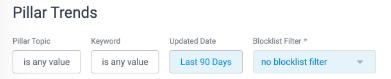
- Pillar Topic: Click into the box to receive a dropdown menu filled with the pillar topics you’ve identified. Check the box next to the topic you’d like to examine.
- Keyword: Filter the results to only certain keywords or phrases. You can also use this filter to exclude any irrelevant terms in the results.
- Updated Date: Filter the results by the timeframe of data you want to look at.
- Blocklist Filter: If you’ve set up a blocklist, you can filter the results based on those specifications.
Filtering the data is important to help you understand how each pillar topic is performing. If you do not select a filter, the data will show rankings from all topics run in the past.
Interpreting the Data
In this section, we will briefly explore each of the four data visualizations available on the Pillar Trends dashboard. Each is important is understanding how your content is performing.
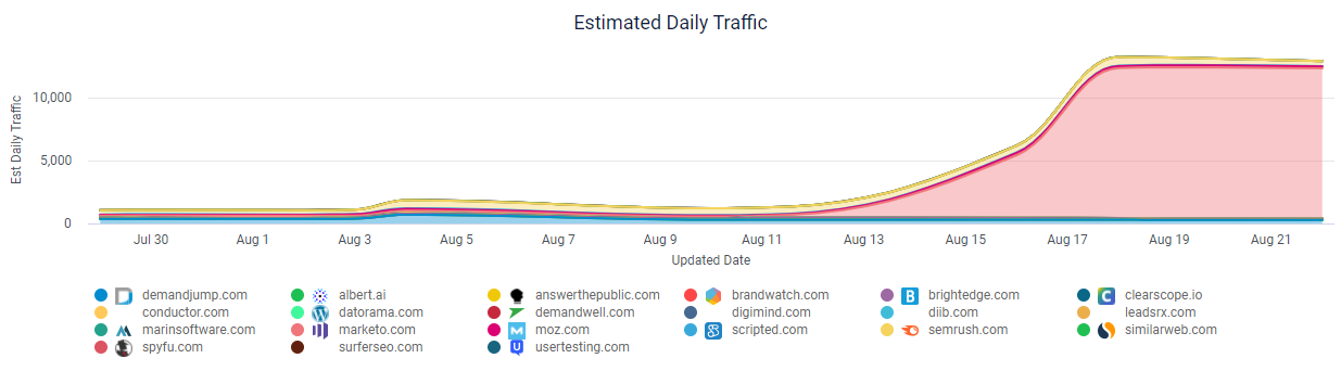
Estimated Daily Traffic
This chart shows your estimated daily traffic from the Pillar Topic you selected. It also shows you the estimated traffic for the competitors you have identified. To exclude competitors from the chart, simply click their names and they will disappear from the chart. You can click the competitor’s name again to make them reappear.
If you see that one of your competitors has a large amount of traffic, you may want to write additional content for that topic to take back the market share.
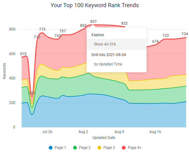
Your Top 100 Keyword Rank Trends
On this chart, you can see how many keywords you are ranking for on the top 100 Google results, with blue indicating that you are ranking on page one, green on page two, yellow on page three, and red on page four or higher.
To drill down, click on any of the lines and select Show All X to see exactly which keywords are ranking and what pages Google surfaced for that keyword.
This chart helps you understand how your content is performing for a certain topic. If your rankings on Google’s top 100 results are increasing, you are gaining more traffic for that topic. The goal is to have as many keywords ranking on page 1 as possible and to see that number increase over time.
When you want to begin improving your content, look at which keywords are ranking on lower pages (2, 3, or 4). Update that content with new or additional high-value keywords.
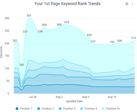
Your 1st Page Keyword Rank Trends: This chart shows you similar data to the previous chart, except it is only showing your first page rankings. This helps you understand how many keywords are ranking on the first page of Google.
The goal is to have as many keywords ranking in position 1 as possible, as that means your content is showing up at the top of the page organically. You also want to see your first page rankings increasing overtime. You can also click into this chart and see exactly which keywords are ranking and what page of your website is showing up for that result.
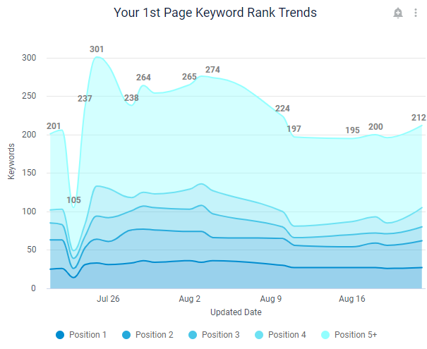
Your 1st Page Keyword Rank Trends
This chart shows you similar data to the Your Top 100 Keyword Rank Trends chart, except it drills down into your first page rankings. This helps you understand how many keywords are ranking on the first page of Google.
For content marketing, your goal should be to have as many keywords ranking in position 1 as possible. Ranking in position 1 means your content will show up as the first organic position on a Google search results page.
You also want to see your first page rankings increasing over time. To drill down into this chart, click any of the lines and select Show All X to see exactly which keywords are ranking in which position.
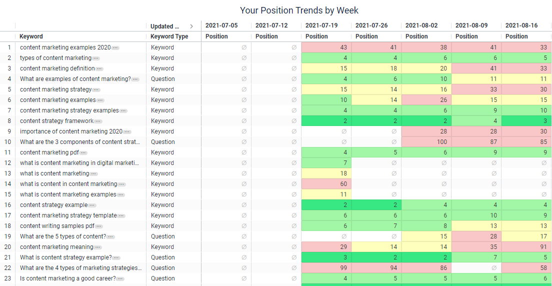
Your Position Trends by Week
This table shows you, for each keyword surrounding the chosen topic, your rankings over a number of weeks. If you see a lot of green, that’s great! That means you have keywords ranking on the first page of Google. If you see blanks or red/yellow cells, your content is either showing up beyond the first page or not at all. These are areas of improvement to focus on.
The goal is to see your rankings going from blank to green as time goes on. Use this chart to understand what keywords to focus on next. In fact, from this screen, select the three dots next to any Keyword and select Write About This to generate a Content Brief!
Pillar Trends: A Use-Case
To give you a complete example of the best way to utilize this dashboard, let’s walk through a DemandJump use-case.
DemandJump wants to improve rankings for the term “content marketing.” We set the Pillar Topic filter to “content marketing” and the Updated Date filter to “Last 90 Days” because we recently published new content surrounding this topic in the last 90 days. We are curious how much traffic we are getting from this topic as well as how much traffic our competitors are receiving.
One of the key insights we discovered is that our competitor Marketo is getting a large amount of traffic from this topic. We will create a strategy to produce more content around this topic to gain back traffic share.
We also want to see, since we posted new content, how are our keywords ranking in the top 100 results on Google, as well as on the first page specifically. Since we posted new content, we are happy (but not surprised) to find that many new keywords are showing up on the first page.
Finally, we want to see for each keyword how our rankings are improving over the past few weeks. We are now going to focus on the terms that are yellow, red, or blank and write content around those keywords.
Dashboard Tips
- If there are any words or phrases in the results that you don’t want to see data for, use the Keyword filter to filter those out.
- You can click into almost any data point and get more information and more granular data.
- Your Updated Date filter should correspond with how long you’ve been focusing on a specific topic.
- Click on the three dots in the upper right corner of the dashboard and select Schedule Delivery to subscribe to have this sent right to your inbox to better track changes over time.
If you have any additional questions, send us a note using the blue message icon in the bottom right of your screen. We’d love to chat with you!